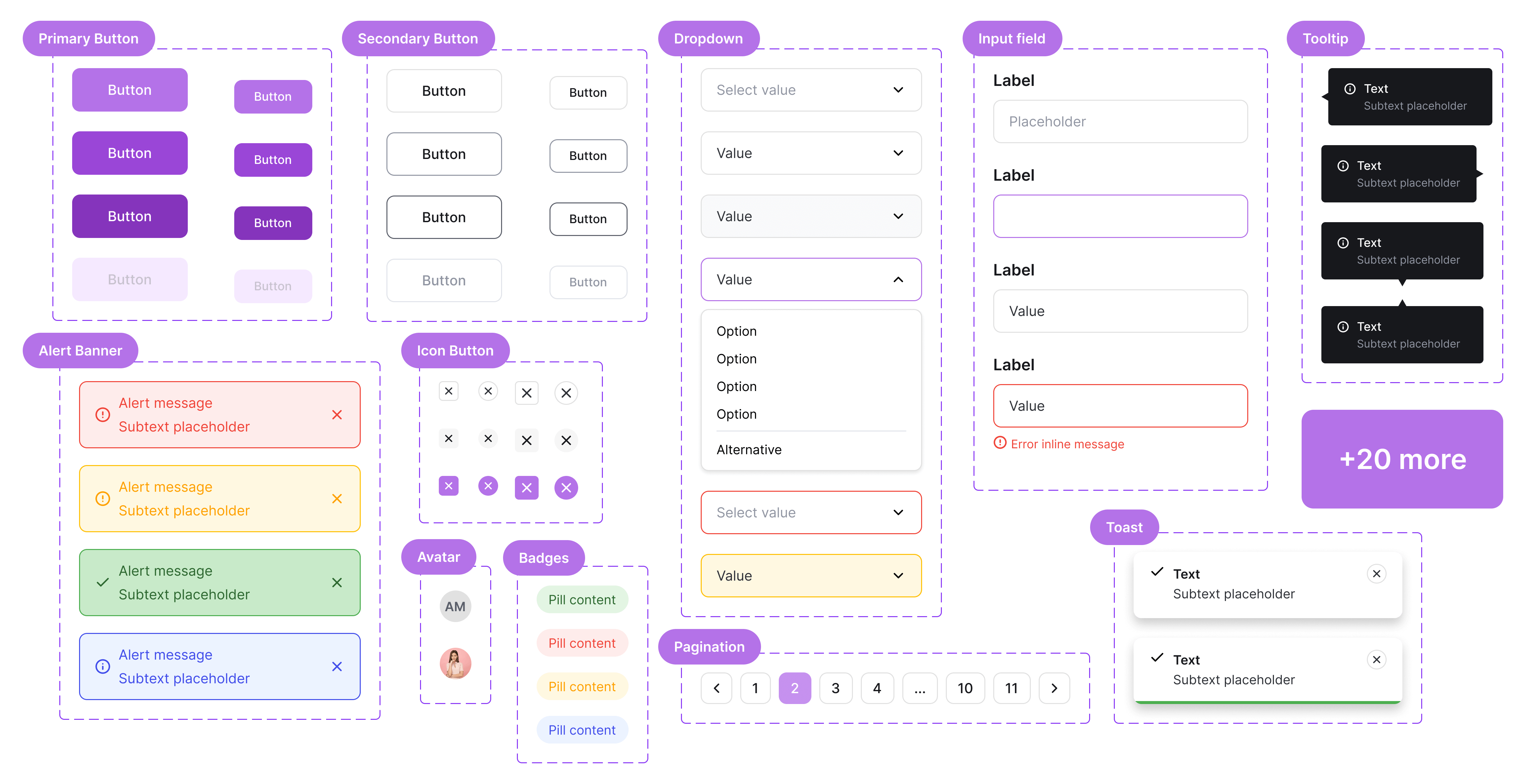
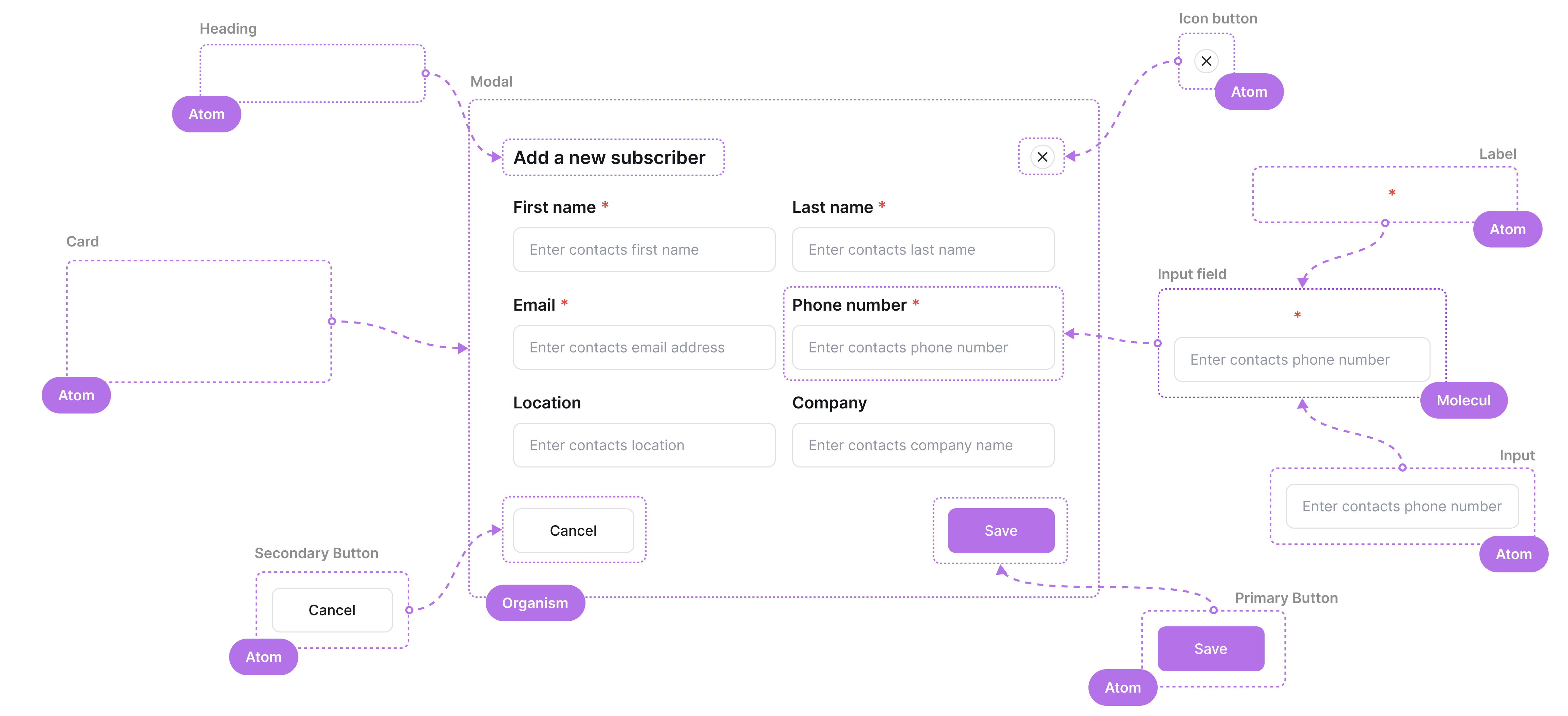
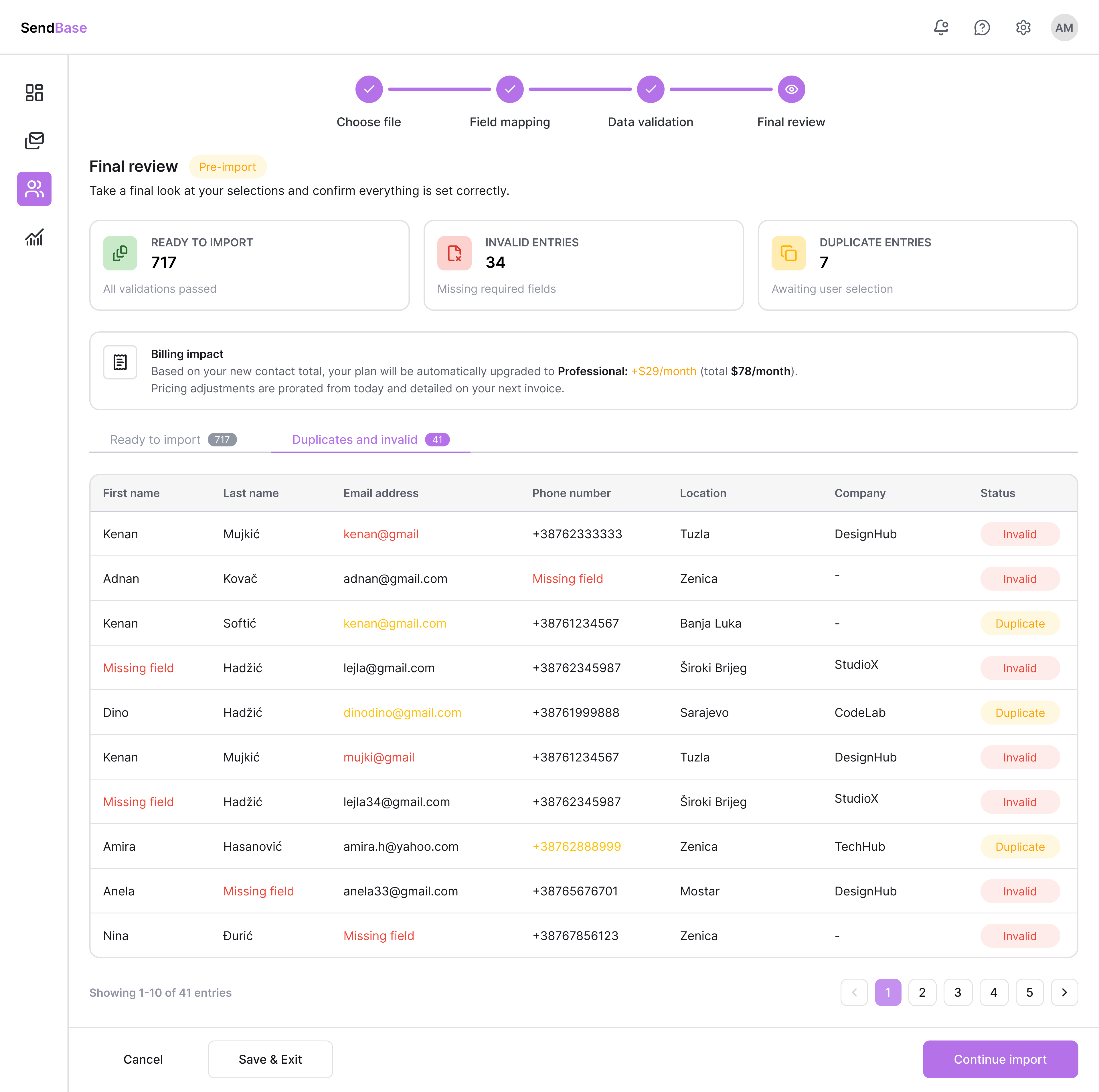
02 - Research
Understanding the competition
Understanding the competition
before touching Figma.
I analyzed MailChimp, MailerLite, Brevo, and ActiveCampaign - their import flows, community feedback, and UX patterns - to find the gaps worth designing for.
Application
Weaknesses
Strengths

- Charges for duplicate contacts upon import
- Confusing bulk import process
- Additional clicks required for basic options
- Beginner-friendly import flow
- Clear step-by-step guidance

- Lacks advanced contact management features
- Occasional CSV import reliability issues
- Inconsistent interface between sections
- Intuitive, user-friendly interface
- Easy subscriber migration from Mailchimp

- No real-time sync - manual updates required
- Instability with large datasets
- Friction when deleting contacts
- Free unlimited contacts, no duplicate billing
- Clean, intuitive interface
- Steep learning curve, overwhelming for new users
- Extra clicks for basic import options
- Unnecessary complexity for simple tasks
- Powerful segmentation and tagging during import
- Ideal for advanced users with complex needs
- Built-in CRM, highly reliable
What real users were saying
Errors don't clearly explain what went wrong.Brevo user · G2
I always end up cleaning the file manually first.G2 reviewer
Duplicate handling takes extra manual work.ActiveCampaign user · Reddit
If the CSV isn't perfect, the import fails.Reddit · r/emailmarketing
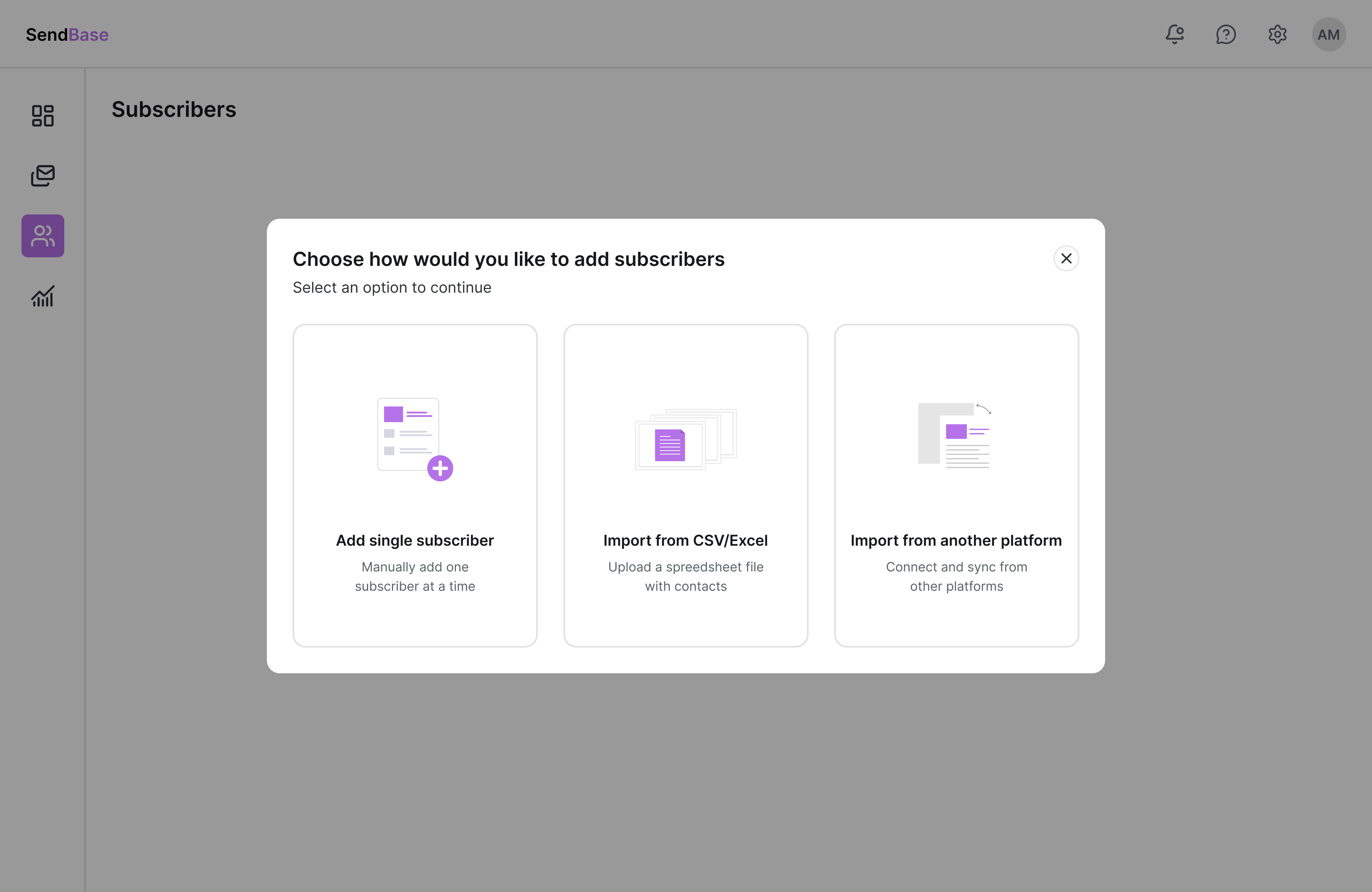
Key insights
What users struggle with - and what they actually need.
Pain Point
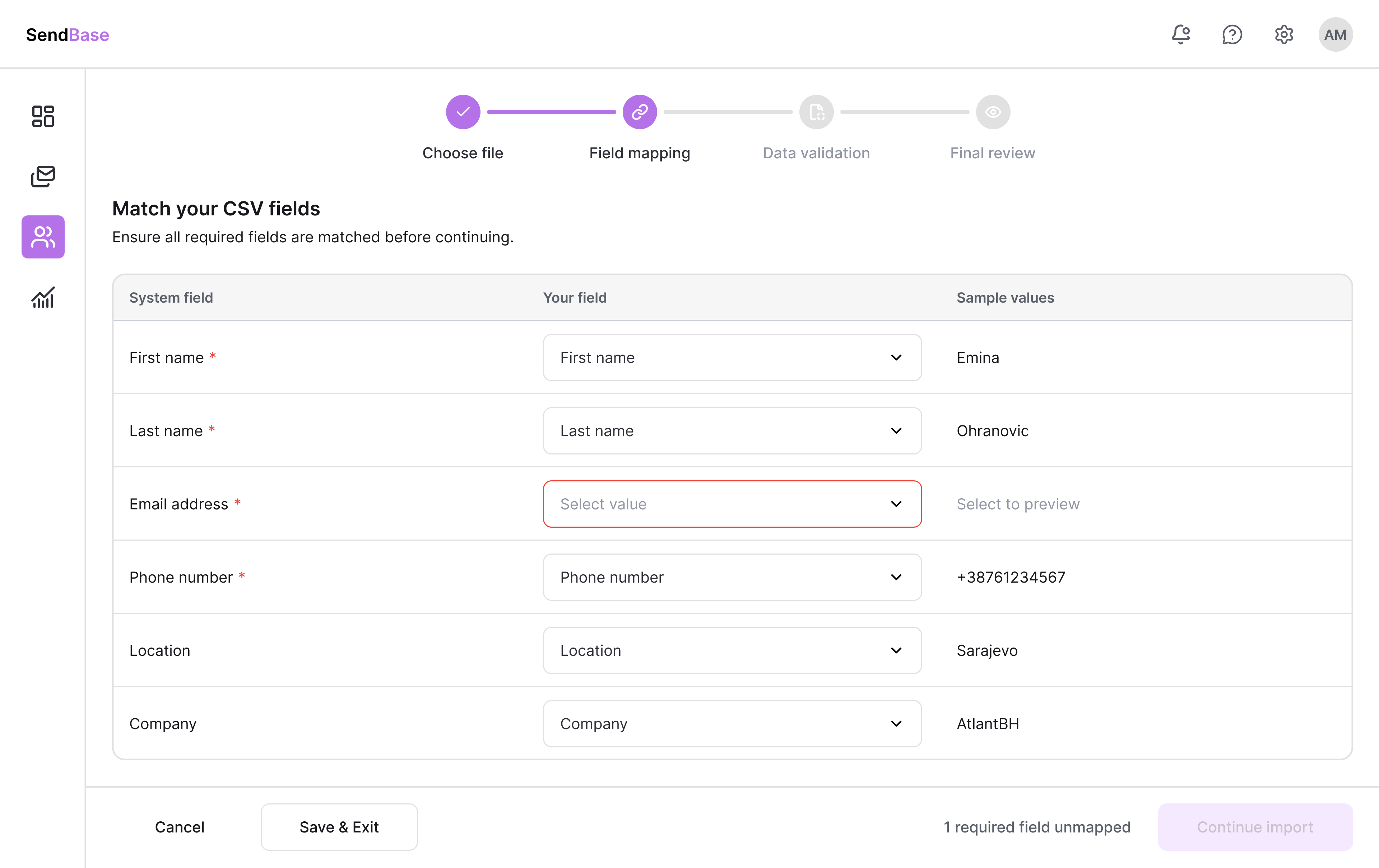
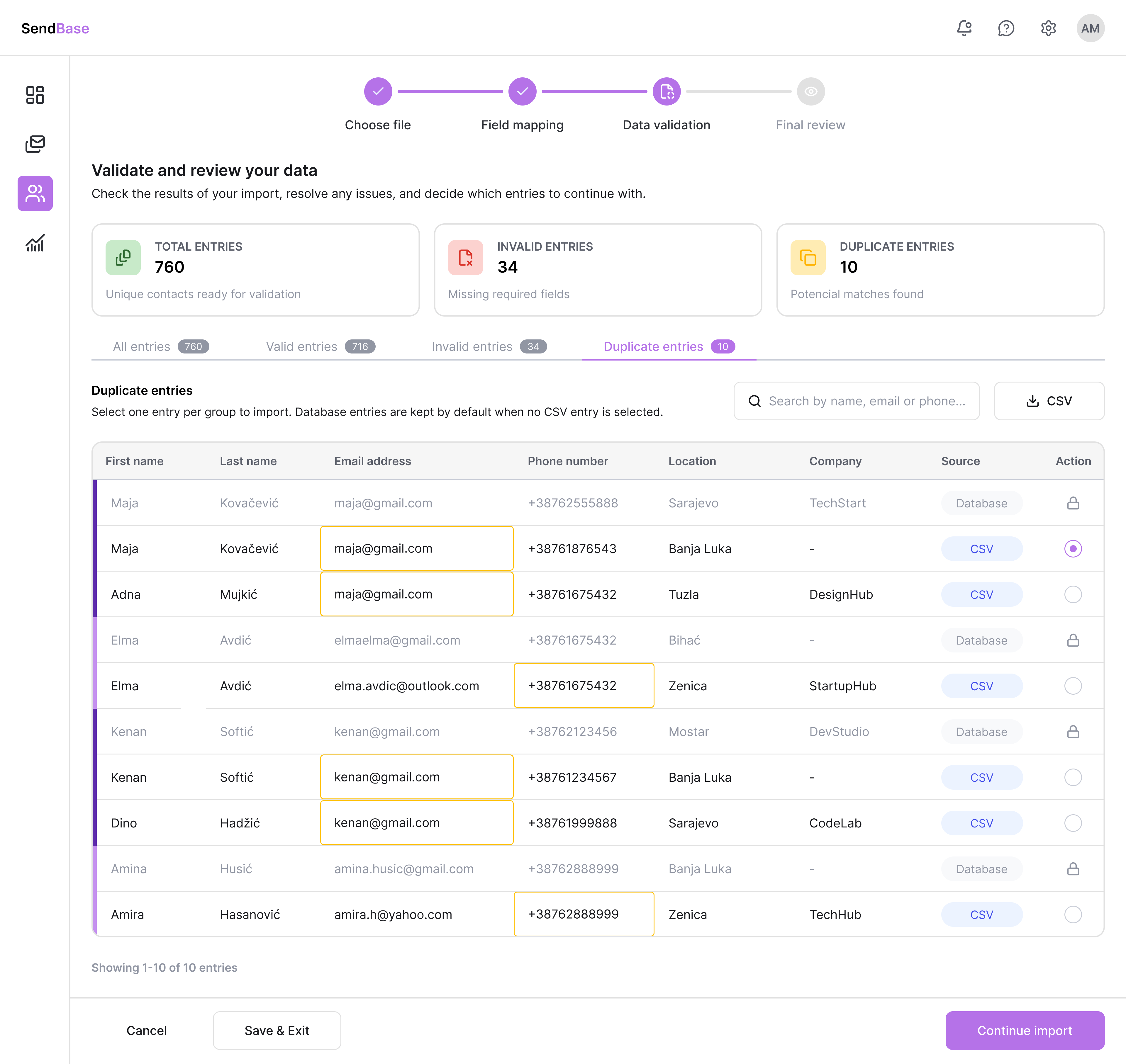
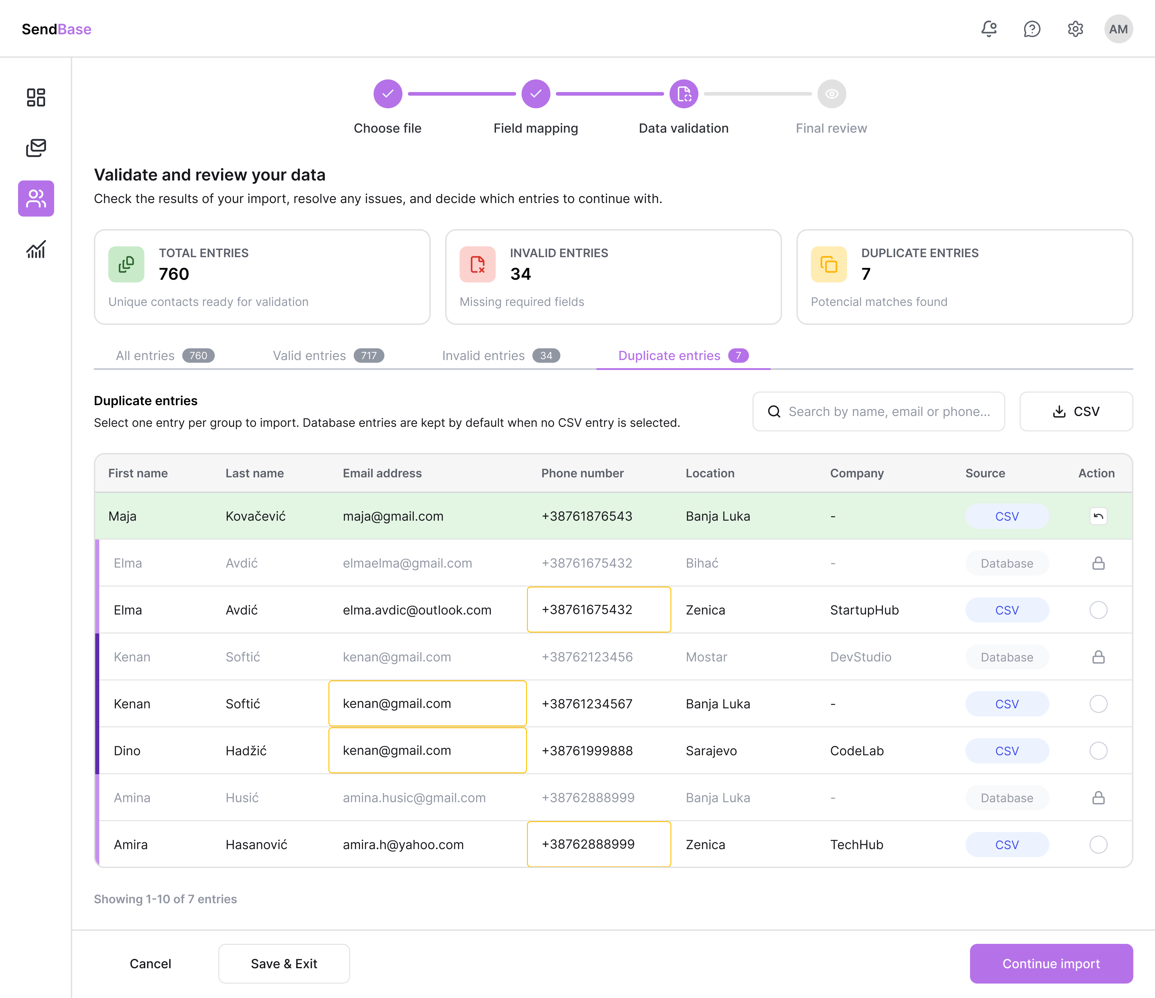
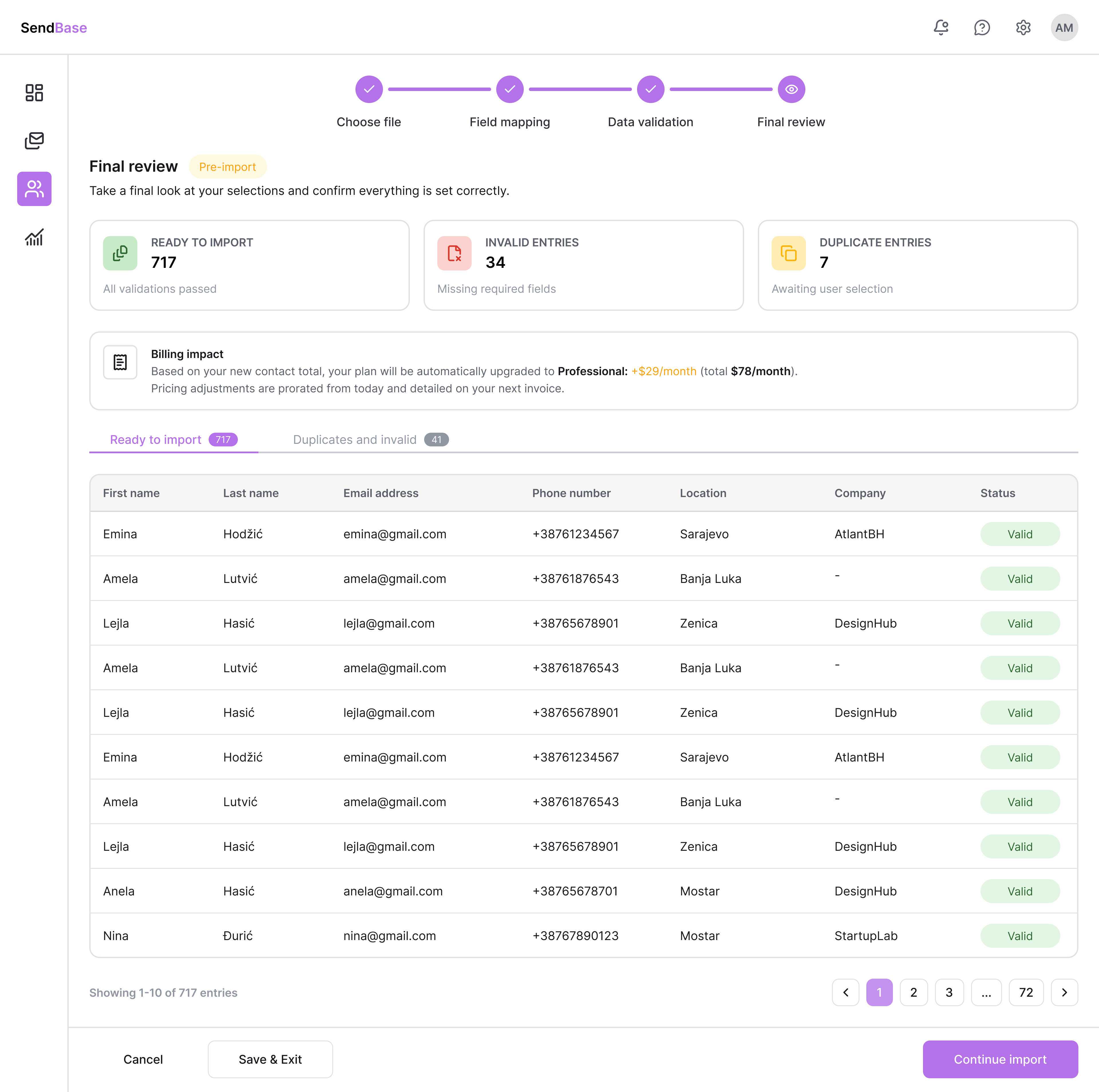
Confusing import process
No balance between simplicity and power. Flows overwhelm first-time users from step one.
Pain Point
Hidden charges & duplicates
Contacts billed without notification. No real-time updates. Users feel blindsided - trust disappears.
Pain Point
Too many unnecessary clicks
Extra steps for basic actions. Steep learning curves. Limited, non-shareable dashboards.